Has a client ever supplied a couple of thousand data points, random excel graphs and tons of other numbers and percentages, and asked that you include it in a couple of slides, a content campaign or a simple landing page? We have all been there. The more access to quantitative information we have the more statistical we become. But how can we then get all those points into a beautiful, meaningful story?
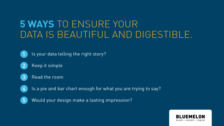
We’ve put together 5 tips to help create a more juicy story and make those data points look amazing.
1 – Is your data telling the right story?
Data, data, data. We have access to so much data these days. Think of the most important message you want to get across, and find one strong, punchy statistic that will start the story for the rest of your narrative. Get your audience ready for all the good stuff you are about to give them. One strong, simple data point will set you up for success. Do you know how many disposable coffee cups are used each year? 16 billion! Nuts, right? Now there’s a data point that would get your attention.
2 – Keep it simple
We’ll say it again. Keep it simple. There is no point having a data visualisation piece that looks incredible, that has so much information that is hard to understand or even worse, just putting data for the sake of data.
3 – Read the room
Data, data, data. We have access tYou might think anyone and everyone will a) understand your content and b) find it engaging. Not the case. Make sure you are engaging the audience in the correct way. For example if you have analytics revolving around construction, steer away from other conflicting visuals distracting the main purpose of the data. In addition, subtle animation is a great way to keep everyone engaged.
4 – Is a pie and bar chart enough for what you are trying to say? Really?
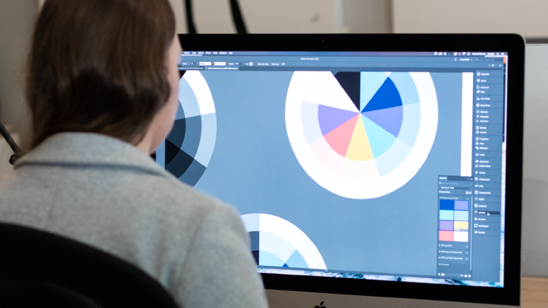
Don’t get me wrong. We love pies and charts, they are convenient, people are familiar with them and they tend to make sense; sometimes! But often, that set of data points may not be properly translated into a pie. There is a lot of power in designing a nice, custom graphic. So, don’t be afraid of trying something new, especially if it helps communicating the impact of what you have found. We get it, not everyone has time to think about this and that is why here at BlueMelon Design we spend loads of time thinking about how can we help you tell the right story through this media.
5 – Would your design make a lasting impression?
Data, data, dataYou want your information to stand out and be talked about, whether it’s within a brochure or on a landing page. Make sure primary design cues such as colour palette, typography and illustrative style are blended within the data visualisation. Interesting fact, while 20% of people remember what they read, 80% remember what they see.1
As BlueMelon’s Director, Juan says “The power of data visualisation lies in making the complex simple”. So, next time you set out to conquer a data visualisation project, remember that you are in control of how you tell the right story.
1 – www.blog.hubspot.com/marketing/power-of-visual-communication
