Back in the day, when I qualified as a graphic designer, the word ‘accessibility’ seemed non-existent in relation to my occupation. While it’s entirely possible I was living under a uni-student shaped rock, the good news is that these days I’m far more enlightened on the subject.
Getting accessible
Recently, I was knee-deep in a project for a client who’s brief stated that the finished product must meet the WCAG 2.0 (or for those still cosy and warm under their rocks, the Web Content Accessibility Guidelines 2.0). During this project I realised that in all my years of being asked to make things look good, I had been asked to consider accessibility only a handful of times. Maybe not even a handful, closer to a pinch.
This made me think: why don’t we adhere to these guidelines as a matter of course, and not just because, legally, some clients have to? As clients who brief and as designers who design stuff, we should be striving to be better at this, and if you’ve ever wondered what more you can do to assist people with disabilities in your day-to-day, this could be it.
What do we mean when we say ‘accessibility’?
According to W3C, ‘accessibility involves a wide range of disabilities, including visual, auditory, physical, speech, cognitive, language, learning, and neurological disabilities.’ As you digest this list, you may begin to consider how the way you design might be relevant here. Do your swatch choices contrast enough for those who are colour blind? Have you included Alt Text in your imagery, and, if ‘purely decorative’ have you tagged it so that assistive technology can disregard it? Does your MREC flash more than three times? If it does, it could potentially induce a seizure in some individuals.
Phew. That tip of the iceberg is a lot to consider, right?
Accessibility can seem like an easy thing to put on the bottom of your to-do list when you’re on a deadline, and especially when ‘thinking accessible’ wasn’t even stipulated by your client. Now, I want to be real here and say that there are professional considerations that we need to make to ensure we don’t lose our clients valuable business (girl’s gotta eat!) such as adhering to brand guidelines, working within limited specs or, more often than not, your client simply wants it a certain way. And that way may just not be accessible.
Take a second and imagine a company who considered accessibility in design as standard practice. For one US digital agency, MCD Partners, this is their reality. “There is never a good reason to overlook accessibility and it should always be viewed as a standard practice.” says James Warren, MCD Partners digital intelligence director.
So, what can we do?
Educate ourselves. Educate our colleagues and clients. Read over the guidelines when you get some downtime. Simply being aware and familiar with what accessibility is, could mean one more person gets to enjoy and be informed by a piece of beautiful content that you’ve produced, because you designed it with them in mind. And informing others of your learnings could give the topic of accessibility in design the momentum it needs to reach a point where it becomes standard practice for us all.
They say it takes 21 days to break or FORM a habit. Here are 21 tips you can use for the next 3 weeks to get in the practice of thinking accessible:
WEEK 1
- Read the WCAG 2.0 Guidelines. You can find them here.
- Read them again, they’re quite long.
- Tell a friend or colleague what you’ve recently learnt about accessibility
- Tell your client what you’ve recently learnt about accessibility and ask if it’s something they’d like you to consider when you create their project
- Find out how others are doing it. There’s a great read for you here.
- Be empathetic. Think about how your design could be perceived or used by someone with a disability.
- Get retrospective. Look back at your past work and evaluate what you could have done to make it more accessible.
WEEK 2
- Check out these great accessibility resources from Adobe.
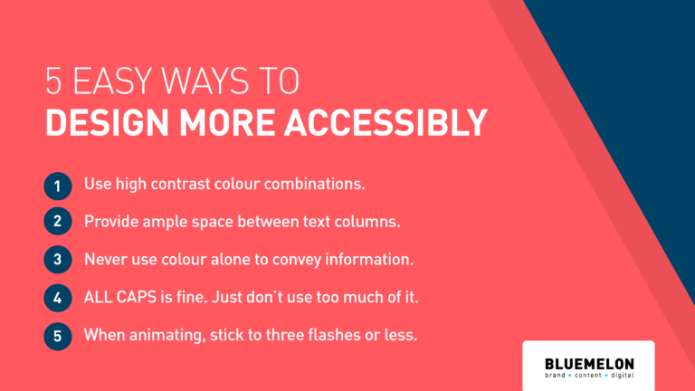
- Beware of colour combos. Make sure you have plenty of contrast between background and foreground colours.
- If an image is vital to the text (for example a logo that is acting as a headline) include Alt Text. There’s an Adobe help topic here about how to do this in InDesign.
- Ensure you use adequate spacing between columns and lines of text.
- Never use colour alone to convey information.
- If your design uses navigation tools, make them clear and easy to use.
- If your design is going to print, 12 is the minimum size you should use.
WEEK 3
- Use descriptive labels on form fields.
- Don’t panic. Do the best you can under the constraints of your brief.
- Present user feedback in a prominent style, for example ‘email address is invalid’.’
- When animating, stick to three flashes or below.
- If your content plays automatically, ensure you include adequate controls to stop/pause/play.
- Get inspired, read this article about how brands are embracing accessibility.
- Run an accessibility report of your finished PDF in Adobe Acrobat Pro. Here’s how.
Do you have any other tips on how to make your projects more accessible? Let us know – we love to learn.
Rach works at BlueMelon Design, where we are striving to make accessibility standard practice. You can join the Blummie community here.
