Love em or hate em, presentations are a medium for bringing ideas to life, closing deals, teaching lessons, challenging norms and providing inspiration. Sure, the bad ones can be sleep inducing. But a well crafted presentation is a beautiful thing to behold.
I have spent a long time analysing what makes for a great presentation. So here’s what I have discovered, along with four golden rules to create your own killer presentation.
THE 90 SECOND AUDITION
If you don’t pique your audience’s interest in the first one and a half minutes, you’ll lose them. (Similar to the 3 second audition concept for social videos, but a little kinder since you have a captive audience) So it’s important to have a well-designed and visually appealing presentation that will not only engage your viewers from the start, but continue to stimulate them throughout the presentation.
The best presentations are simple, elegant and image-based. They should compliment and reinforce your message. They should not compete against you for the audience’s attention.
NOT EVERYTHING STICKS
People recall 10% of that they hear, 20% of what they read and 30% of what they see. Your audience can’t hear, read or see what you’re presenting if their mind has wandered off. That’s why the initial 90 seconds is so important to ensure you capture their attention and maintain it.
But did you know that giving a presentation is just as much an opportunity to advertise and showcase the awesomeness of your brand?
So, how do you achieve a well-designed and visually appealing presentation as well as use the opportunity to promote your brand? With the 4 golden rules.
THE 4 GOLDEN RULES FOR GREAT PRESENTATIONS
- Keep your presentation simple and succinct, use the most minimal amount of text you can. Cut out the waffle!
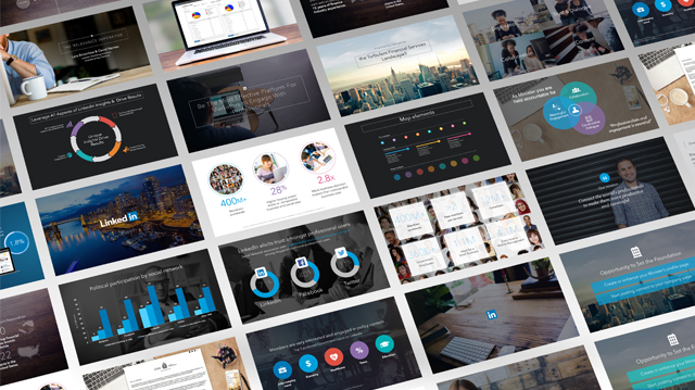
- Grab the attention of your audience from the beginning with great visuals. High quality graphic images can do this. Use hi resolution images that fill the entire slide from edge to edge.
- Avoid typical PowerPoint templates that don’t align with your brand. Enlisting the help of a creative studio can also help to pull of a slick, on-brand presentation… Fast.
- Practice, practice, practice. Don’t spend a 6 hours working on a presentation in PowerPoint only to practice it for 3 minutes before you get up in front of an audience. Dedicate the last 20% of your efforts to practicing the presentation out loud – more if you’re nervous about public speaking.
A presentation that is professionally prepared and designed to represent you and your brand is an super worthwhile use of your time and your marketing/advertising dollar. It’s an opportunity for your brand to stand out and to shine.
“Every new business pitch should do three things: Inform, educate and entertain” – Steve Jobs
So if you have a need to prepare a presentation or would like to find out how a bespoke presentation template could help elevate your brand, give us us shout. Our team would love to help you kick butt.
Check out a project like this here
