Making data digestible with infographics
itching to share. They just couldn’t quite work out how to present it to
their audience within the organisation.
BRANDING | CONTENT
Infographics, Presentation
Yahoo7 is one of Australia’s largest digital content publishers, with a monthly unique audience of over 4 million. They have a massive digital footprint spanning across editorial, news, video and search, giving them access to a huge amount of data on customer behaviour. They were itching to share this, but couldn’t quite work out how to best present it to their audience.
How we turn Yahoo7’s data into valuable content?
The challenge was working out the best way to showcase the data so that it would be easy for their readers to understand.

Unlocking the narrative behind the numbers
Yahoo7 came to us wanting to share their findings and create a better understanding of particular habits in different industries. They knew their audience would not respond well to one large research piece or whitepaper including all the data.
We translated over 500 raw data points into
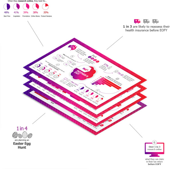
- 5 infographics - 1 Presentation
The content was broken up into bite-sized pieces over a series of topics, which would be ‘drip fed’ to readers over a six month period.
Infographics
The infographics were simple one page overviews of each topic, and designed in a way that allowed the reader to take in a number of insights very quickly. They were more of a quick-look ‘on the go’ piece, rather than the type that takes time to download and read.
Presentation
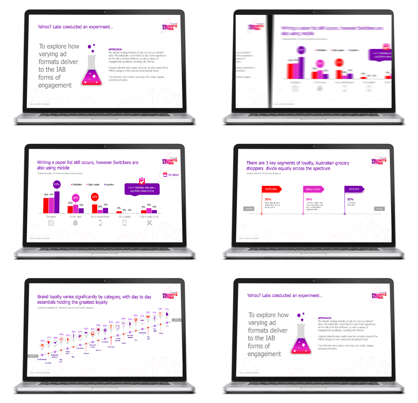
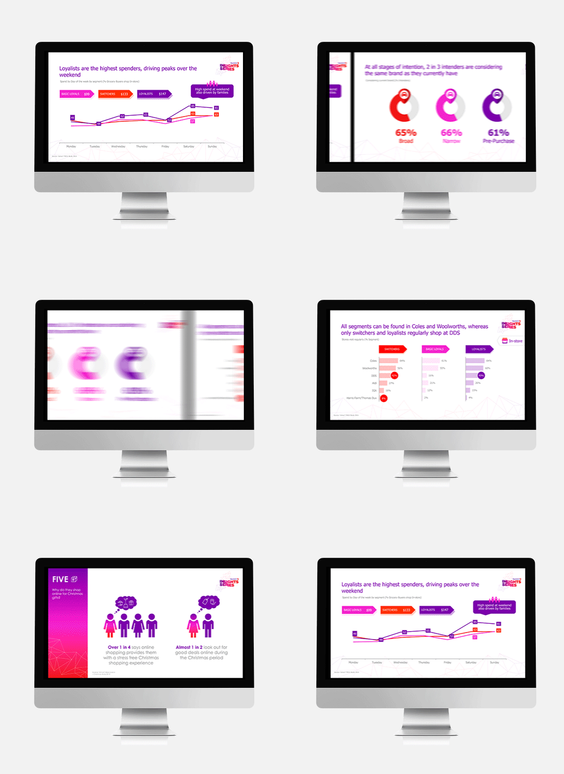
We designed the presentations as more detailed versions of the infographics, spread across a number of pages.
They were created in Powerpoint so that the client could have access to the data if they needed to, distributed via SlideShare and produced in PDFs to enable downloading and sharing from the Yahoo7 website.
Presentation
We designed the powerpoints as more detailed versions of the infographics, spread across a number of pages.
They were created in Powerpoint so that the client could have access to the data if they needed to, distributed via SlideShare and produced in PDFs to enable downloading and sharing from the Yahoo7 website.

Design & branding
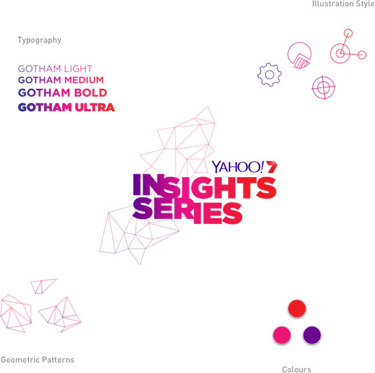
Clear. Insightful. Concise. Maximum impact.
The campaign was so popular that Yahoo7 decided to release another series the following year with a fresh new look and feel.

Elika
Commercial Communications Manager
Yahoo7
Do you want to turn your data into beautiful, insightful content?
Well then you’ve come to the right place. Become a thought leader in your space with the help of talented team who can turn your data into valuable content. We’ll recommend the perfect format for your project, depending on your audience and objectives – from static or animated infographics to videos and PDFs.
WHAT ARE THE BENEFITS OF WORKING WITH BLUEMELON DESIGN?
Getting brands right is our specialty, we understand what you need and will deliver on your core business values
We like to start by identifying the problem space and getting to know your business
A clearly defined business goal is crucial to any successful content marketing initiative. We say ‘no’ to content for content’s sake. Need help figuring it out? Talk to us. We’re happy to help.
We focus in understanding your main pain points
Before we begin we’ll need to understand you and your team’s pain points. Every company is different, so it all starts with listening. From there we’ll go through various stages depending on what we uncover during this stage.
We are humans that value data
If content is king, data is queen. Strategically led data-driven content is what we’re all about. The more data and insights about your brand and target audience you can share with us – the better! If you’re not sure what data might be helpful, or if it exists – never fear. We’re here to help.

