We know how frustrating it can be when you spend hours deliberating over a design, trying to make it hit its mark, without knowing exactly what needs to be changed. While many parts of design and content can be subjective, we recommend including A/B testing or what’s also called split testing into your processes so you can make sure your campaign is the best it can be. Remember the focus group scenes with a one-way mirror and a group of people sitting in a circle trying the newest brand of cereal? Luckily, extensive testing can now be done all digitally – and us Melons have found it to be really helpful in determining what’s going to speak to users more, particularly for LinkedIn. People are being bombarded with content day in and day out so you need yours to stand out among the noise.
Read on for our top tips on finding the perfect solution with your LinkedIn content.

In a nutshell, A/B testing is a way to compare two versions of content to figure out which one performs better. Our creative director Juan defines it as the ability to isolate creative factors of an ad or a piece of content that you have and make little tweaks. This way you can start to understand what is actually performing, what your audience is liking and why they are paying attention to a certain element of that particular ad. Ideally, there will only be one singular difference between the two designs or pages so we can understand the reason behind the performance.
Here are some side-by-side tests you can try out on LinkedIn:
1. Question vs statement
2. Quotes vs statistic
3. Colours
4. Images
5. Animated vs static images
6. Call out audience in intro copy vs no call-out
7. CTAs (change copy)
8. Hashtags included vs no hashtags
9. Company logo on image vs no company logo
10. Call out asset type in intro copy (e.g. “infographic”) vs no call-out
Let’s dive into some real examples of how A/B testing enhanced designs on LinkedIn below.
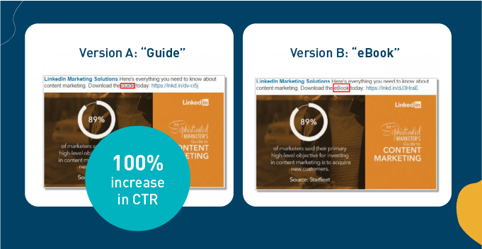
Here the word “guide” performed much better than the term “eBook.”
For more info, check out our guide on empathetic copy here, plus what copy works best for engagement on LinkedIn here.
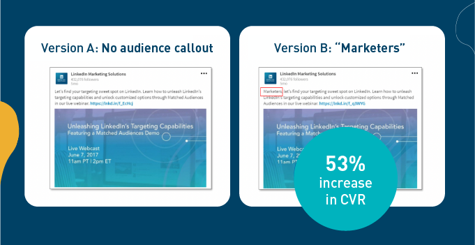
Addressing the target audience by their title “marketers” had a higher conversion rate than a generic introduction in the copy.

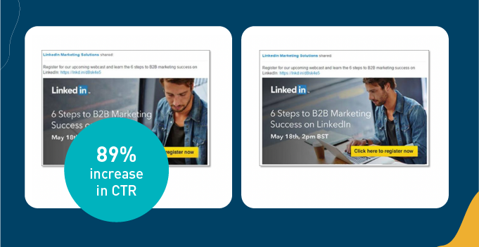
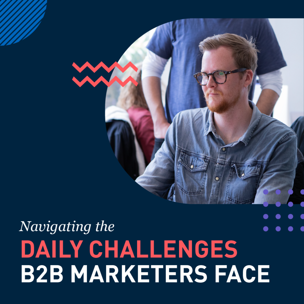
Here, people wanted to see more face and less laptop!

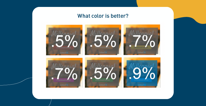
Blue was the winner for most clicks on the CTA for this campaign.
As you can see in our LinkedIn examples above, the extra time taken to test can have a huge impact as you isolate creative factors that are driving success in your campaign. It helps you collect data on the user experience early on and help you feel confident in the follow-through of your work. Give the people what they want, we say!
Which A/B test from today’s post are you going to try first?
Antigone Anagnostellis works at Bluemelon Design, which is proud to be a Linkedin Partner creative agency with a number of countries around the world. You can join the Blummie community here.


